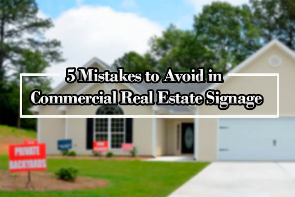
5 Mistakes to Avoid in Commercial Real Estate Signage
The first impression is always crucial in any business. Proper real estate signage is no exception – think of it as of your business image. It is the first thing people see. If you have unique real estate signs, it automatically makes you different, hence, noticeable. And it absolutely does not matter, whether residential or commercial real estate signs – both work just fine.
That is why creating a unique real estate sign is so important in this industry. You can’t just buy a sign and put in anywhere! This will not bring you any results and can potentially lead to lost customers. At Fortuna Signs, we will not let you do this to your business. We have prepared a shortlist of the most common mistakes in commercial real estate signs. Avoid them to achieve the best results possible and develop the best real estate sign board design!
But before we get started, let’s run you through the most popular real estate signage styles so you will understand your options.
Which Real Estate Sign Design to Choose?
Before planning your commercial real estate sign strategy, you should decide what type of sign you want. There are a lot of options in this market. Most likely, you have seen classic real estate signage – “Colonial Post”. Even though this kind of sign is trendy, it is not the only one that is effective. Next, take a look at the most frequently used commercial real estate signs:
- Old but gold – Colonial Post. Usually, it looks like an inverted letter “L” pole with a sign attached to it. It’s the perfect fit if you need to tell everyone that your house is for sale.
- H-Frame stake – most commonly this real estate signage is used as a temporary sign, due to its construction. They are H-shaped, very lightweight, and usually, have a wireframe. Politicians often use them before elections, as it is not hard to set them up or remove them, and it is easy to transport them.
- Frame – a simple metal or wooden frame, covering a sign. You can use it for just one sign (Standard Option) or for two smaller signs (Double Rider).
- A-Frame – well-known to anyone, so-called “sandwich board” signs are quite a good option if you need your sign to be transportable. However, there is one problem with this type of real estate sign board design – if you leave them for a long period of time without your attention, chances are they may disappear.
- Vinyl Window Cling – if the property you want to sell happens to have really large glass windows, attach these clings to them! You can order custom vinyl signs from us.
- Feather Flag – quite an unusual option but very effective. A fabric flag with your logo (or any other content you want) is fixed to a tall pole. In a windy environment, the fabric will flutter, drawing the attention of passersby.
Each and every real estate sign design has its own dimensions and space available. These factors may affect your sign, and they are the reason why you should always know what the design will be before starting to create the content.
Last but not least, before we proceed with mentioning the common mistakes is legislation, concerning the real estate signage in your location. Many populated areas, including New York, have their own regulations regarding specific types of signs that are allowed, their shape, and where to place them. Study the law before choosing a sign.
5 Most Common Mistakes to Avoid
1. Even the best real estate signs are here only to help an agent sell the house.
It does not matter if you have a unique real estate sign; this alone, won’t sell your house. You need an agent to complete the deal. And the most vital part of the sign is to provide all of the necessary information to the potential customer, such as:
- Agent’s name and phone number
- Web address to find more information
- Agency name and logo
The sign should not have any information that does not help to sell the house. Usually, customers do not care if, for example, whether or not the agent has an MBA.
2. Do not think of your commercial real estate sign as a simple picture. It is your brand.
We have already mentioned that real estate sign design is vital in creating a proper business image for you and your company. A thoughtfully made sign can increase your brand awareness quite significantly!
We advise putting your logo on the sign, somewhere it will definitely be seen by people. Make it bright and abundant and put it in the center – your goal is to make it noticeable. Also, do not forget to use your brand’s colors on the sign. The more visuals you add to your sign, the more recognizable it will be in New York or elsewhere.
Passers-by usually do not want to buy a house. However, if they see your brand’s color signs on a daily basis, somewhere deep in their mind, they will remember you. And when the day comes, and they want to buy a piece of property, or their friends want and ask for advice, their memory will kindly remind them about your colors, and hence, your brand.
3. Do not choose fonts that are impossible to read.
It may sound a little obvious; however, businesses often suffer from unreadable fonts on their signs or brochures. As a result, people do not remember the name of the company, which means a loss of potential customers. Choose the fonts carefully for your commercial real estate sign. Even if you like this unique font and you think it would look fantastic on the poster, take a closer look: is this font easy-to-read? Would people have a clear understanding of what’s written on the sign? If you have even the slightest doubt – change the font.
Try to use one of these best real estate sign fonts:
- Helvetica
- Garamond
- Verdana
4. Correctly fill in the “white” space in the real estate signage
The area of your unique real estate sign which is left empty, without any lines, colors, or text is called white space (it doesn’t have actually to be white). This space plays a vital role in the overall impression of your sign, its readability, and its aesthetics.
According to Mark Winter from IdentityPR, this white space has great importance, equal to other design features. Nowadays, designers tend to fill the space with as many shapes or written text as possible. But a “crowded” sign is not easy to read without any additional effort. Leave around 30 to 40% of the sign empty to give it a “lighter” look. Your real estate signage should be easy to look at, with no unnecessary visual tension.

It will be better if your audience can associate you with something simple and easy, rather than with tension or something heavy. So, do not put everything you have on the sign. Just tell people who you are, how to contact you, and what your offer is. A lot of white space gives people a feeling of confidence, peace, and serenity.
5. No Call-to-Action aka CTA
CTA is a must-have for your real estate signage. Your sign should inspire a person to take a specific action, like coming inside the house to take a closer look, asking some questions, visiting your agency’s website, or calling an agent for more information, and much more.
Business owners tend to underestimate the CTA. However, these are small details which really matter. One adequately placed CTA can give you a client, and that’s not bad, right?
A Few More Tips for the Perfect Real Estate Signage
We have covered the most common mistakes people make in commercial real estate sign strategy. Now, you can avoid them and make your sign bring you profit!
Here are some additional tips Fortuna Visual Group is happy to share with you:
- Use QR codes in your real estate signage.
QR (quick response) codes are being used everywhere today. Though many businesses still do not understand how profitable it can be to use them. The user scans a barcode using a special app on a smartphone, and then this code redirects him to the website, photo, or video you want to show. QR codes save people a lot of time and effort. That is why using this technology will definitely give you a competitive edge over other real estate companies.
- Think carefully about your commercial real estate sign location.
Let’s imagine that you already have the best real estate sign. You like it, the fonts are nice and accurate, the design is fancy, and the content is perfect. Now, it’s time to place the sign. We already know that a sign should draw a lot of attention from passers-by, so that they will notice the sign, then the property. Ideally, the sign will prompt them to go inside the house and take a look, or, at least, look for more available information. So, how should one complete this task?
Always place your sign in a place where it can be seen from any corner or angle. High visibility from the nearest intersections or highways is also very important. When people stop and wait at traffic lights, they have time to look around. That is their chance to notice your real estate signage!
Never put a sign in a location that has plenty of bushes or trees. They cover up your sign, making it impossible to notice. And if no one can see your sign, then what’s the point in installing it? If you are not sure where to put a sign, you are always welcome to ask our sign installation experts.
You can increase the possible reach if you place your “open house” or “for sale” signs at the nearest entrances to your neighbor properties. But first, check out local legislation and, if needed, homeowner’s association rules, to avoid any kind of unpleasant experience with the law.
In other words, don’t be afraid to get creative with your sign placement. Remember, the more you stand out from the crowd, the more potential customers you’ll get. But do not get too carried away – there is no need to put a dozen commercial real estate signs in one yard! You will risk looking like an Internet spammer.
Conclusion
Real estate signage is a whole new chapter for any business owner. There are a lot of things to consider, many decisions to make, and experiments to conduct. Often, it’s too hard to simultaneously run a company and focus on such small but vital details. That is why we are here. Fortuna Visual Group has been operating in this field for a long time now and has a lot of experience and information to share. You can focus on your primary goals and leave the troubles with creating, placing, and maintenance of your real estate signage to us. Contact us, and let’s get started!


